Thursday, December 8, 2011

Movie Poster Update #4

In this version, I moved a few pieces around first, the paper was moved farther down to create more balance. Once i moved that, I also moved the hand and highlighters. From there, I decided to move the "J heart E 4ever" on the opposite side of the poster. This allowed me to move the movie credits lower and add a tagline that reads, "this will make you want to study." I think it fits with the mood of the poster because it is somewhat comical, as are the doodles. And if a viewer would have looked at the poster without the tagline, they might have had trouble understanding what it may be about.

Thursday, December 1, 2011

Update of my Movie Poster Project.

I decided to add a hand into the poster That way the viewer can get the feel of a school atmosphere as they see a student's hand in the process of drawing the doodles. I also chose to use a left hand instead of the right because left handed-people are generally more creative and artistic in nature.

Since I added the hand, I decided to move the blue highlighter to the lower right so that there can be a balance within the entire poster. The arrangement forms somewhat of a swirled path guiding the viewer's eye, starting from the hand, to the tip of the pen, to the yellow highlighter, to the blue highlighter,  to the movie credits, then to the arrow, and finally to the title. 

 All I need to add is the movie credits and the poster will be finished.

Once again, this is a movie poster for a documentary informing people about how students pay less attention in class lectures (especially in high school and college years). 

Tuesday, November 29, 2011

Movie Poster Inspiration


Movie Poster Project__ Work in Pregress

This is a movie poster for a documentary that is focused on the attention-span of students while in class. 

If you have noticed, many students have doodles drawn all over their notes. It proves to show that students do not study as much, which effects overall test scores of students in America.

Monday, November 7, 2011

Movie Poster Project; Logotype

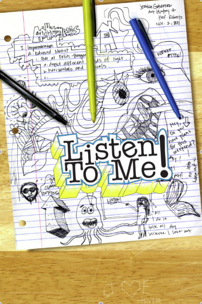
I have decided to base my movie on a documentary about students who do not spend the entire class time paying attention to lectures and find themselves zoning out into day-dreams or start doodling on notes. I thought it would be somewhat comical, yet informative.  

My inspiration for my movie poster comes from the posters of the movie "Diary of A Whimpy Kid," which was simple, yet funny and straightforward. The basis of black and white helped balance out the poster without having to worry about what colors to choose to stand out more. 

I have decided to use a scan of a college-ruled sheet of paper that is doodled around with images and unfinished class notes. It will also include notes that would be passed around for another student to read. I also plan to scan a pencil and/or a pen, which is what is "used" to  make the doodles.

As far as a title, I wanted something that stood out without the use of many colors and that was relevant to the movie so that people would get a sense of what the movie is about. 

If I decide to use color, it would be the simple yellow, pink, green, blue, and or orange which are typical colors for highlighters. 

Here is the sample of my logotype for my movie poster. 
Though it looks relatively simple, I plan to add detail using Photoshop.