In this version, I moved a few pieces around first, the paper was moved farther down to create more balance. Once i moved that, I also moved the hand and highlighters. From there, I decided to move the "J heart E 4ever" on the opposite side of the poster. This allowed me to move the movie credits lower and add a tagline that reads, "this will make you want to study." I think it fits with the mood of the poster because it is somewhat comical, as are the doodles. And if a viewer would have looked at the poster without the tagline, they might have had trouble understanding what it may be about.
Thursday, December 8, 2011
Tuesday, December 6, 2011
Thursday, December 1, 2011
Update of my Movie Poster Project.
I decided to add a hand into the poster That way the viewer can get the feel of a school atmosphere as they see a student's hand in the process of drawing the doodles. I also chose to use a left hand instead of the right because left handed-people are generally more creative and artistic in nature.
Since I added the hand, I decided to move the blue highlighter to the lower right so that there can be a balance within the entire poster. The arrangement forms somewhat of a swirled path guiding the viewer's eye, starting from the hand, to the tip of the pen, to the yellow highlighter, to the blue highlighter, to the movie credits, then to the arrow, and finally to the title.
All I need to add is the movie credits and the poster will be finished.
Once again, this is a movie poster for a documentary informing people about how students pay less attention in class lectures (especially in high school and college years).
Tuesday, November 29, 2011
Movie Poster Project__ Work in Pregress
This is a movie poster for a documentary that is focused on the attention-span of students while in class.
If you have noticed, many students have doodles drawn all over their notes. It proves to show that students do not study as much, which effects overall test scores of students in America.
Tuesday, November 15, 2011
Monday, November 7, 2011
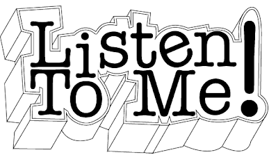
Movie Poster Project; Logotype
I have decided to base my movie on a documentary about students who do not spend the entire class time paying attention to lectures and find themselves zoning out into day-dreams or start doodling on notes. I thought it would be somewhat comical, yet informative.
My inspiration for my movie poster comes from the posters of the movie "Diary of A Whimpy Kid," which was simple, yet funny and straightforward. The basis of black and white helped balance out the poster without having to worry about what colors to choose to stand out more.
I have decided to use a scan of a college-ruled sheet of paper that is doodled around with images and unfinished class notes. It will also include notes that would be passed around for another student to read. I also plan to scan a pencil and/or a pen, which is what is "used" to make the doodles.
As far as a title, I wanted something that stood out without the use of many colors and that was relevant to the movie so that people would get a sense of what the movie is about.
If I decide to use color, it would be the simple yellow, pink, green, blue, and or orange which are typical colors for highlighters.
Here is the sample of my logotype for my movie poster.
Though it looks relatively simple, I plan to add detail using Photoshop.
Tuesday, November 1, 2011
Movie Poster Research
Tuesday, October 11, 2011
Updated Character Scene
Here is a new updated character scene. I think it has a different atmosphere and feel to it compared to the previous one.
Tuesday, September 27, 2011
Work In Progress-Character Scene
Here's a preview of my character scene. In the scene, a business man goes to Jane's office for an interview to see if she is qualified for a new architectural assignment. After hearing how professional and great her work is, he was surprised to see that her office was filled with pink. The entire room was pink, like Candyland. When his boss called to see if she was qualified- in embarrassment, he stuttered out his reply.
Tuesday, September 20, 2011
Artist-A-Day: Dan Dubowitz
The artist I chose was Dan Dubowitz. I personally found interest in this image because it lures the viewer into the vanishing point. Another thing I liked about the image is that not only does Dubowitz use the architectural structure to make a statement, he also uses props to promote curiosity and interest. It brings the viewer to question, "Why there are so many books thrown on the floor? What books are they? What message is he sending through this image?" And there are many more questions that arise. I like that the image has a mysterious feel to it. It makes me want to know what is behind the walls and where the location of the structure is.
Read more about Dan Dubowitz, or check out his website.
Sample Character and Research
My cartoon character’s name is Jane. She is a business woman who seems very sassy and stylistic, but is very serious when it comes to her work; and it shows. I chose to use her as my character because that is the type of person I am. Her personality is very out-going and friendly. Her character could be used on logos for coffee mug companies or even t-shirts. An example of a scenario would include her working in an office late at night. Usually people would usually be home by that time, but being the hard worker she is, she is still there and looking like she did when she had just walked out of the door.
Character Sketches
Subscribe to:
Comments (Atom)


